


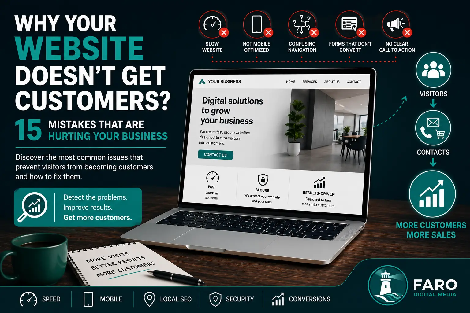
A website can receive traffic, look professional and even appear in Google while still failing to generate calls, form submissions or sales. When this happens, the problem is not always a lack of visitors. Often, the website is not helping people understand the offer, trust the business and take the next step.
In this guide, we examine 15 mistakes that can stop your website from winning customers and explain how to correct them. Some improvements are simple, while others require a strategic review of design, content, search visibility and user experience.
1. It is not immediately clear what you do
A visitor should understand within a few seconds what your business offers, who it helps and why they should continue reading. Generic headlines, vague slogans and company-centred copy force users to work too hard to interpret the message.
The top of the page should communicate a specific proposition. Instead of saying only “innovative digital solutions”, explain the service you provide, the market or location you serve and the outcome you help clients achieve.
2. There is no visible call to action
Many websites provide information without clearly telling the user what to do next. Opportunities are lost when buttons are hidden, use vague wording or appear only at the bottom of a long page.
Use direct calls to action such as “Request a quote”, “Book a consultation” or “Request a website audit”. The next step should be easy to identify on both desktop and mobile devices.
3. The website loads too slowly
Every additional second increases the chance that visitors will leave before seeing your offer. Large images, unoptimised video, unnecessary plugins, external fonts and poorly organised code can significantly slow a page down.
Optimising images, serving modern formats, reducing scripts, configuring caching and prioritising visible content improve both user experience and SEO performance.
4. The mobile experience is poor
A website may look excellent on a large monitor but perform badly on a phone. Small buttons, hard-to-read text, menus that cover content, overflowing tables and awkward forms all create frustration.
Mobile design should not simply be a smaller desktop layout. It should be reviewed specifically for small screens, touch navigation and slower connections.
5. Visitors cannot quickly find what they need
Complicated navigation makes users work too hard. When services are grouped confusingly, important pages are hidden or the menu contains too many options, people may leave before finding an answer.
Organise information around customer needs. Each main service should have its own page containing benefits, process information, frequently asked questions and a clear call to action.
6. The copy talks too much about the company
Your experience, history and values matter, but visitors primarily want to know how you will solve their problem. A website that repeatedly says “we are”, “we have” and “we do” without connecting these statements to outcomes can feel distant.
Turn features into benefits. Do not simply state that you use modern technology; explain that it produces a faster, safer, easier-to-maintain website that can grow with the business.
7. You do not provide enough trust signals
Before contacting or buying, users look for evidence that reduces risk. A lack of reviews, genuine examples, contact details, legal information, guarantees or previous work can create doubt.
Include authentic testimonials, verifiable projects, clear business information, visible contact methods and transparent explanations of how you work.
8. The design looks outdated or inconsistent
Visual presentation affects perceived professionalism. Mixed typography, inconsistent colours, poor-quality images, untidy spacing and elements from different design styles can make the business appear neglected.
A strong redesign is not about adding effects. It is about creating visual hierarchy, consistency, clarity and an experience that reinforces the credibility of the brand.
9. Your forms create too much friction
Requesting too much information during the first contact reduces completion rates. Forms also perform badly when they do not confirm submission, fail on mobile, use difficult captchas or fail to explain what happens next.
Ask only for the information required to begin the conversation. Test that the form works, that messages arrive correctly and that the user receives a clear confirmation.
10. You do not have dedicated pages for each service
A single page listing every service is rarely enough to rank or convert effectively. Different customers have different needs, questions and decision criteria.
Individual service pages allow you to address each search intention more precisely, use relevant examples and present a more focused offer.
11. Your SEO attracts the wrong audience
More traffic does not automatically mean more business. A website may rank for informational searches with little buying intent, for locations the company does not serve or for services that are not a priority.
Review the queries that generate visits and create content aligned with real customer needs. SEO should attract relevant people, not simply increase a number.
12. You do not answer common objections
Visitors often want to know what the service will cost, how long it will take, what is included, how the project will be managed and what happens after delivery. When the website does not answer these questions, potential customers may delay contacting you.
Add frequently asked questions, process explanations, indicative price ranges where appropriate and clear details about support, maintenance and ownership.
13. You do not measure the visitor journey
Without data, it is difficult to see where users are being lost. Total visitor numbers do not reveal how many people viewed a service page, clicked a button, added a product to the basket or abandoned a form.
Configure events and conversion funnels. Measure clicks on calls to action, WhatsApp, phone numbers, email links, forms and shopping carts. This information allows improvements to be prioritised according to real behaviour.
14. The website is not maintained
Broken links, outdated information, visual errors, expired certificates and forms that stop working all damage trust. An unmaintained website can also develop security and compatibility problems.
Carry out regular reviews of content, performance, backups, security, forms and functionality across different devices.
15. Your offer looks the same as every competitor
When several businesses use almost identical messages, images and service lists, users often compare them on price alone. Your website should explain why your approach is different and which type of client you serve best.
Define a specific value proposition. It may be based on specialisation, personal service, speed, custom design, industry experience, support, technology or a distinctive process, but it must be relevant and demonstrable.
How to identify what is going wrong
You do not need to rebuild the entire website immediately. Begin by reviewing the areas with the greatest potential impact:
- Ask someone unfamiliar with the business whether they understand the offer within five seconds.
- Test loading speed on mobile and desktop.
- Test every form, button and contact link.
- Review which pages receive traffic and which generate actions.
- View the website at several screen sizes.
- Compare your proposition with those of your main competitors.
If you identify three or more of these mistakes, your website is probably losing opportunities every week. The solution is not always to attract more visitors. Often, the greatest growth comes from converting the traffic you already have more effectively.
Turn more visits into genuine opportunities
At Faro Digital Media, we design and optimise fast, clear and results-focused websites. We analyse performance, mobile usability, content, SEO and the conversion journey to identify the obstacles preventing a website from generating enquiries.